There was talk on the quiltart list today about learning about colour. Some people do well with colour theory and the making of colour wheel, tonal charts and tint charts, and doing
Itten inspired contrast studies. Others, like me, are less than inspired with these formal exercises and do better with a hands on approach to learning about colour; how it can sing when next to another colour, how tints and tonal variations can enrich the pallette, how unusual colour contrasts can express emotion. When I used to teach painting, I found that hands on exercises with a tangible finished product was very satisfying to the young student as well as an intuitive way of understanding colour.
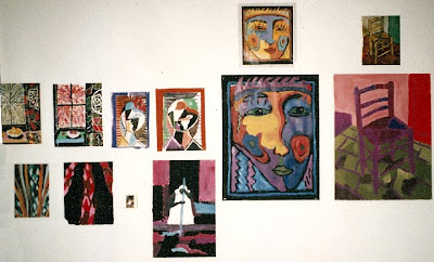
One favourite exercise was to select a painting by a modern master and reproduce the image in complementary colours to the original. The tones and tints must remain the same however. This made the student really analyze the original and really SEE the colour...not as a simple red for instance. But a medium toned reddish green perhaps. The opposite would be a medium toned greenish red. The results were quite wonderful and taught the student more than colour theory in that they became aware that amazing colour contrasts can be achieved with more subtle forms of a given hue. As a corollary, they also discovered that the colour palette of the original was carefully selected to achieve the artists' intent. Here are some examples from a highschool class:

You may recognize some of these ...the top left a Matisse interior, left middle top Picasso portrait and the far right Van Goghs chair. The contemporary yellow blue face is an artist whose name escapes me.
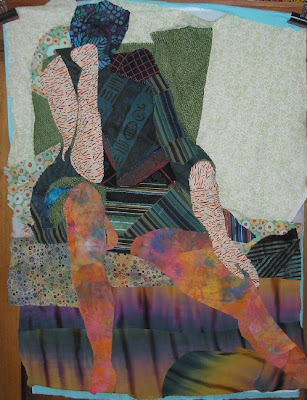
I offer similar exercises in fabric where a limited palette of only two colours in all their permutations plus black and white, results in a rich exploration of ALL the possibilities within the parameters.

So for people like me whose eyes glaze over at the mention of theory, this kind of alternate method of hands on discovery may be just the ticket!


